Visualizing logs
The trainer save a lot of information at each epoch: the training or validation loss in particular. It can also send the information to Comet.ml on the fly. Below are examples for tracking models.
Using Comet.ml
Comet allows you to visualize many metrics and to see the hyperparameters of your mode. Go discover their incredible website!
Example of Comet.ml view:
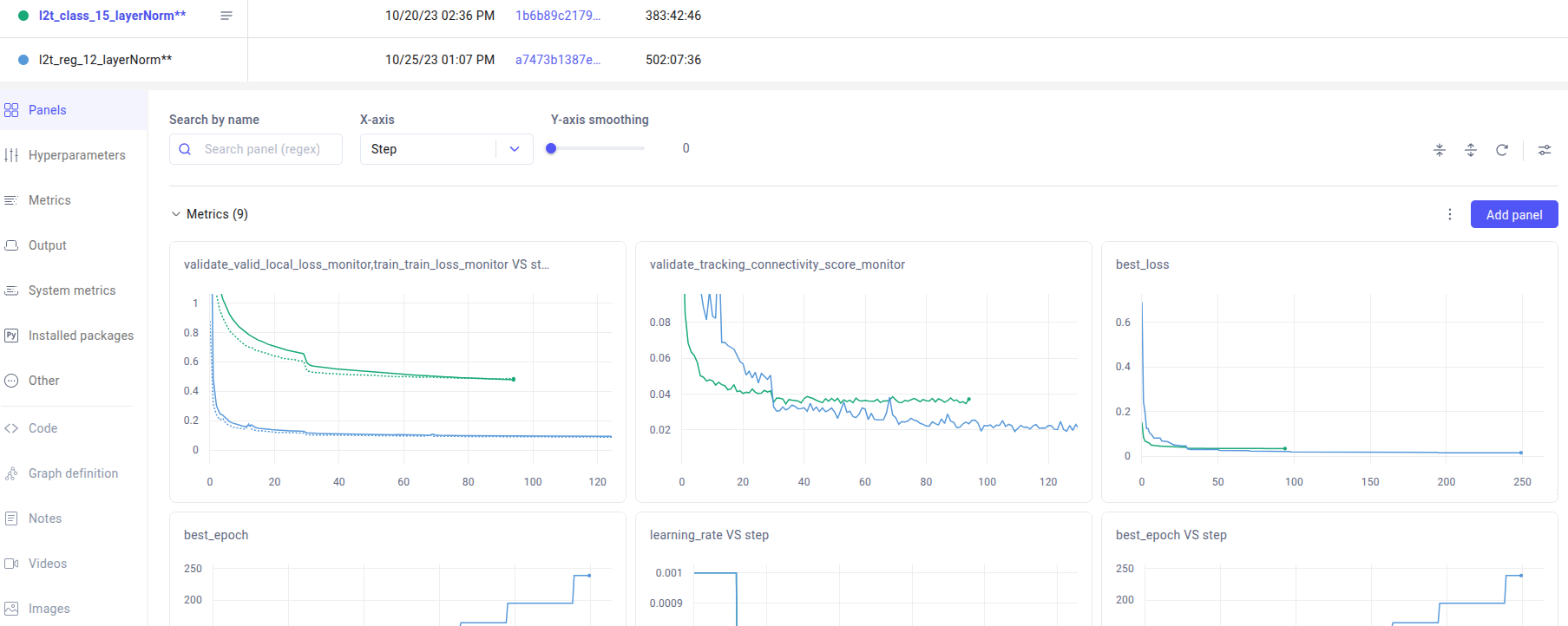
Our scripts save many values at each epoch, such as
The training local loss
The validation local loss
The validation GV phase’s FP rate (see upcoming paper. Named validate_tracking_connectivity_score on comet.)
The learning rate
and more
Using logs on your computer
Alternatively, you can run our own matplotlib-based scripts to see the evolution of the logs. For instance, to plot the curves for all experiments saved in $exp_root:
dwiml_visualize_logs $exp_root --nb_plots_per_fig 1 --xlim $xlim \
    --save_figures $figures_prefix --fig_size 6 8 --show_now -v \
    --graph "Training local loss" train_loss_monitor_per_epoch $local_loss_range \
    --graph "Validation local loss" valid_local_loss_monitor_per_epoch $local_loss_range \
    --graph "Training vs validation local loss" train_loss_monitor_per_epoch valid_local_loss_monitor_per_epoch $local_loss_range \
    --graph "GV phase's connectivity FP rate" tracking_connectivity_score_monitor_per_epoch 0 0.5

dwiml_visualize_logs my_experiment --graph training_time_monitor_duration \
  --save_to_csv training_time.csv  -f --xlim $xlim --remove_outliers
You can also plot the correlation between some metrics:
dwiml_visualize_logs_correlation $exp_root \
    valid_local_loss_monitor_per_epoch tracking_connectivity_score_monitor_per_epoch \
    --rename_log1 "Local valiadtion loss" --rename_log2 "GV phase: FP rate"